Pages

Friday 20 September 2013

Essie - Midnight Cami


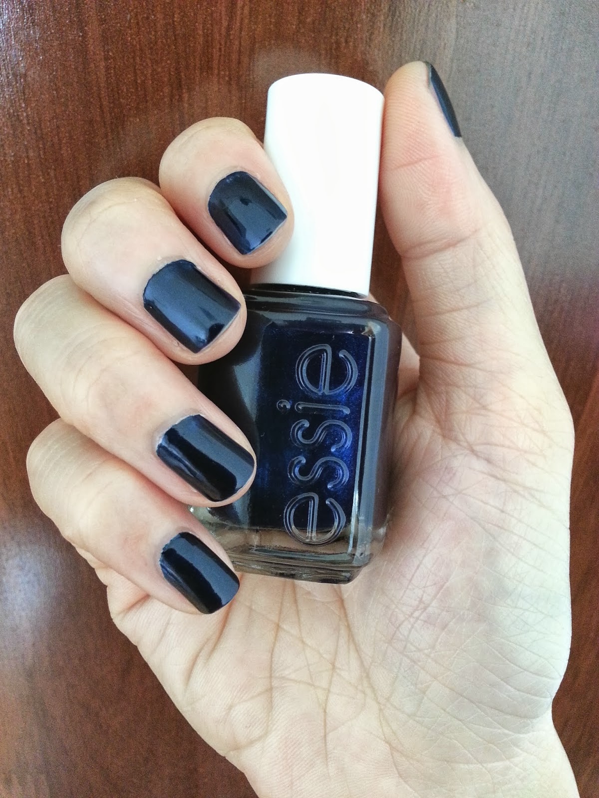
It's fun when weekend comes - manicure time! This week, I would like to introduce this cool color from Essie in Midnight Cami.  As its name, this color from Essie is a deep navy blue that is as dark as the midnight sky. It is so close to black color and yet have the blueish tone in it. Black and blue at the same time, just like sapphire. 


As you can see from the bottle, there are some really tiny indigo colored micro shimmer. On the nails, the micro shimmer is barely visible but it had lead to a duo-chrome effect that is so cool. It is not as harsh as gold or silver chrome nail polish but just have the correct metallic glow in it. To me, it is just 1 thin line within rockstar and elegance for this color, depending on what kind of outfit you are wearing. 


The formula is really good and the pigmentation is so rich. 1 coat is enough to apply evenly on the nails with full opacity. I am normally a 2 coats person but I had only used 1 coat here. I had applied 2 coats of OPI Natural Base Coat, only 1 coat of nail polish and 1 coat of my favourite Seche Vite Top Coat. Yes, the numbers of coat just switched. Instead of applying 1 coat of base coat and 2 coats of nail polish, I had done it other way round. Reason being is that this color stains a lot and it's difficult to remove. I applied extra coats of base coat by hoping to reduce stain on the nails. I would say this is the only drawback of this nail polish.

All in all, I really like this Midnight Cami from Essie. Cool color with cool effect. I just wish it doesn't stain that much so that I could apply it more frequent. But, come to think of it, I could actually keep this color longer with me and had it available with me for a longer time, right? Lol, self consoling =p. Alright, that's it for this round, chaos.  


Monday 16 September 2013

Burt's Bees - Tinted Lip Balm


I am kind of crazy about Burt's Bees products lately and also tinted lip balms. When these 2 items combined together, I'm definitely not going to miss it. Hence, I had purchased these 3 beautiful little tubes and I am really satisfied about it, never feel regret with the money spent. 

There are 9 shades available for the tinted lip balm range and I've chosen Hibiscus and Pink Blossom. On top of that, I've also picked up the Replenishing Lip Balm with Pomegranate Oil. Let us look at the swatches. 


From left to right:
  • Hibiscus: A warm dust pink with orange undertone. 
  • Pink Blossom: A sweet and girlish medium pink. 
  • Replenishing Lip Balm with Pomegranate Oil: A barely noticeable hint of pink. This is actually a lip balm rather than a tinted lip balm. I've included this here as it's still able to bring some color to the lips. 


Both Hibiscus and Pink Blossom have the sheerness in them which are so easy to pull of and look so natural. Replenishing Lip Balm with Pomegranate Oil is almost transparent in color that only provide a hint of pink. This would be suitable for those who don't like make up and yet don't want to look pale at the same time. The hint of pink just provide the correct tone of color to look fresh.  


All 3 lip balms are in plastic tubes except Hibiscus and Pink Blossom come with the extra paper box packaging that I like. It just look so simple and nice. The plastic tubes design are so simple that make them so handy and will not take up much space in the handbag. I carry 3 of them in my handbag so that I could have a few choices every time. No glamour or fancy design on the tubes as Burt's Bees is all into environmental friendly. Keep any Burt's Bees empty tubes or bottles that you have finish using and bring to any Burt's Bees outlet on every 31st of the month to purchase any product with certain amount of discount. 5% or 10% discount, I can't really remember =p (applicable in Malaysia and Singapore).  

All in all, I am loving all these 3 beautiful tubes. It's so moisturizing that keep my lips hydrated all day long. My lips were cracking with the prickly feeling before this but it had all gone after using these lip balms. The pigmentation is just nice and wearable. I am not a make up person but I don't feel awkward wearing these natural looking colors all day long. Reapplying is only required after meals which I find it reasonable. 

Finally, the best part of Burt's Bees that I like most is their products are all 100% natural and paraben free. You could enjoy all the goodness in it and be pretty inside and out. 


Saturday 14 September 2013

Sephora Collection: Color Hit Nail Polish - Red Berry Smoothie


I am loving this gorgeous color from the Sephora Collection - Color Hit Nail Polish in Red Berry Smoothie. It is a warm medium purple with red undertone. In another word, violet. I never have a violet color in my collection so this color is kind of unique to me. 


This color is not too soft as pastel colors do, not too striking as red colors and not too dark as those vampy colors. It is just nice and hit at the right tone that is so feminine, edgy and fun at the same time. Wearing this color is just like being low profile and yet managed to create the attention. 

The formula is pretty good, smooth in application and drying time is pretty fast. 1 coat is good enough for full coverage but I always prefer 2 coats. As usual, I've applied OPI Natural Base Coat, followed with 2 coats of nail polish and completed it with 1 coat of Seche Vite Top Cost. The color just pops and it is so flattering. I believe this color is really suitable for fair to medium skin tone. 


I find that this color is really worthwhile to add into my collection but there is only one drawback - the rectangular handle that is not handy enough for application and also the size (5ml is kind of small size for the price to me - RM26.00 per bottle). Other than that, I really enjoy wearing this pretty violet color - Red Berry Smoothie from the Sephora Collection: Color Hit Nail Polish. For me, violet is the new red. 


Sunday 8 September 2013

Europe Trip: Part 4 - Bratislava

Day 7 - 8 
The trip to Bratislava (capital city of Slovakia) was kinda relaxing. We were basically taking our own time over there. We had rented a suite at the old town area. This place was so spacious and cozy. There was a kitchen equipped with all the kitchen utensils, a dining area, 1 big bathroom, a living room with a TV set, and a bedroom that was spacious enough to fit in 1 queen size bed, a single bed plus a closet. The owner had also added another queen size bed at the living room and it was just nice for 5 of us. We even bought groceries and cooked our dinners there. Sounded like home? Exactly! That was what we felt when we entered the suite. Here is the email luxury@t-zones.sk or apartmentsmartin@gmail.com if you are interested. I highly recommend this place if you wanted to rent a suite in Bratislava. 

The tourist spots in Bratislava's old town are all reachable by foot. We were just walking around at the old town area and visiting those places. The sun was shining bright all the time and the breeze was just cooling enough that made us felt fresh all the time. Alright, I shall stop my talking and let the photos show you how Bratislava's old town looks like. 


Mozart was performing behind this wall at the age of 6 back then during the 17th century. 

The main entrance. Can you imagine how old this building is? Since 17th century or even earlier.

Bratislava Castle. Built on a rocky hill that located in the middle of Bratislava and it is the outstanding feature of the city.  (Pardon me, I think I had kinda spoil the view a little =p)


The souvenir shop at the Bratislava Castle. Lovely setting, don't you think so? 

Panoramic view from the Bratislava Castle. The orange roof tops are all from the old town area and the very right side is the modern city. Such a big difference with just 1 separation of the Danube River.  


Last but not least, my favourite shot in Bratislava. 

Staying in Bratislava old town was relaxing and we had the chance to recuperate. Life looks pretty relaxing over there and it's a nice place to just get out from the hustle and bustle city life. We had some good rest and continued our journey. Which place we went next? Stay tune to find out. Till then, see ya soon. =) 

Previous post: 
Europe Trip: Part 1 - Paris 
Europe Trip: Part 2 - London 
Europe Trip: Part 3 - Budapest 


Saturday 7 September 2013

Sephora Collection: Color Hit Nail Polish - Pink Paradise


I had recently purchased this nail polish from Sephora. It's the Sephora Collection - Color Hit Nail Polish in Pink Paradise. It is a creme hot pink with an orange undertone. The color is so bright and it looks like neon to me. I would say this as my 1st neon nail polish. 


I pretty like the formula of this nail polish. It is so smooth and not streaky at all during application. The color is really pigmented as well. 1 coat and you will have a full coverage. 


For me, I'm always a 2 coats person as I prefer the color to reach its full opacity. Over here, I had applied my OPI Natural Base Coat, 2 coasts of this nail polish and sealed it up with the trustworthy Seche Vite Top Coat. The color pops and it is so vibrant. 


I find that there is a downside of this product. The handle is not the usual rounded handle like other products. Like its bottle, the handle is rectangular in shape with rounded edges. It is not that comfortable to hold and had caused a bit of challenge during application even with the nice formula they have. The size is kind of small too. 5ml/ 0.16 ft. oz is kind of small size as compare to the standard size (15ml or 13.5ml at least) of majority nail polish brands in the market. 


I am not really sure whether I will purchase this Color Hit range again due to the handle and the size (RM26.00 per bottle) even they have 74 choices of colors available. The formula and pigmentation is pretty attractive though. I am still contemplating. Perhaps, purchase during sales season? =p